
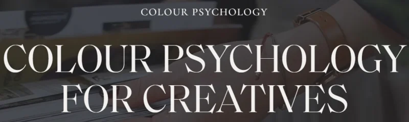
Fiona Humberstone – Colour Psychology For Creatives
Introduction: Why Colour Is More Than Just Visual Choice
Colour is often treated as decoration in design and branding, but in reality, it is one of the most powerful communication tools available to creatives. Every shade, tone, and palette carries emotional weight, shaping how people feel about a brand before they even read a single word.
The work of Fiona Humberstone in this field has helped designers, entrepreneurs, and creative professionals understand how colour influences perception, positioning, and profitability. Her approach bridges psychology, branding, and visual storytelling in a way that turns colour into a strategic business asset rather than a purely aesthetic decision.
This guide explores her philosophy and expands on how colour psychology can be applied effectively in creative industries to build stronger, more intentional brands.
The Psychology Behind Colour in Branding
Human beings are highly visual creatures. In fact, studies suggest that up to 90% of snap judgments about products are based on colour alone. This means that before typography, messaging, or even product quality is considered, colour has already set expectations.
Different colours evoke different psychological responses:
- Blue often signals trust, stability, and professionalism
- Red conveys urgency, passion, and energy
- Green is associated with balance, health, and growth
- Yellow represents optimism and creativity
- Black suggests luxury, power, and sophistication
These associations are not random; they are shaped by cultural conditioning, biology, and repeated exposure in everyday life.
Understanding this emotional language allows creatives to design identities that feel aligned with their brand values rather than relying on guesswork or personal preference alone.
The Core Philosophy of Fiona Humberstone’s Approach
At the heart of this methodology is a simple idea: your brand should feel like your business before it even explains what it does.
Rather than choosing colours based on trends or aesthetics, the focus is on aligning visual identity with brand personality, target audience expectations, and emotional positioning.
Her framework encourages creatives to think in terms of:
- Who the brand is speaking to
- What emotional response the brand should create
- How the brand should be perceived in its market
- What values and personality traits need to be communicated visually
This shifts colour selection from a subjective design choice into a strategic branding decision.
Building a Brand Personality Through Colour
One of the most powerful applications of colour psychology is in defining brand personality. Every brand can be mapped to a set of human-like traits, such as playful, elegant, bold, nurturing, or innovative.
Once these traits are identified, colour becomes the bridge that translates personality into visual language.
For example:
A luxury consultancy may lean toward deep neutrals, blacks, and metallic tones to communicate authority and exclusivity.
A wellness brand might use soft greens, pastels, and earthy tones to evoke calm and healing.
A creative studio could embrace vibrant, contrasting palettes to signal innovation and originality.
The key is consistency. When colour aligns with personality, the brand becomes instantly recognisable and emotionally coherent across all touchpoints.
The Role of Emotion in Visual Identity
Emotion is the driving force behind consumer decisions. People rarely choose brands purely based on logic; they choose based on how those brands make them feel.
Colour acts as the fastest emotional trigger in design.
Warm tones tend to create feelings of comfort, excitement, or urgency. Cool tones often communicate calm, trust, or professionalism. Neutral palettes can suggest balance, minimalism, or sophistication.
When used intentionally, colour can guide emotional journeys:
- A calming palette can reduce anxiety and build trust
- A bold palette can inspire action and confidence
- A soft palette can encourage openness and approachability
This emotional alignment is what transforms a brand from visually appealing to deeply memorable.
Common Mistakes Creatives Make with Colour
Many designers and entrepreneurs underestimate the strategic importance of colour. Some of the most common mistakes include:
1. Choosing Colours Based on Personal Preference
What you like personally may not align with what your audience needs to feel.
2. Following Trends Blindly
Trendy palettes often expire quickly and can make a brand feel outdated within months.
3. Lack of Consistency
Using too many colours across platforms weakens brand recognition.
4. Ignoring Audience Psychology
Different demographics respond differently to colour based on age, culture, and industry expectations.
Avoiding these mistakes is essential for building a strong, sustainable brand identity.
How Colour Influences Brand Positioning
Positioning is how a brand is perceived in relation to competitors. Colour plays a major role in shaping this perception.
For example:
- Minimal monochrome palettes often position a brand as premium and high-end
- Bright, saturated colours can position a brand as youthful and energetic
- Earthy tones may position a brand as natural, organic, or grounded
By carefully selecting a palette, creatives can intentionally place their brand within a specific market category without needing to say it directly.
This is especially powerful in crowded industries where differentiation is critical.
Creating a Strategic Colour Palette
A strong brand palette is not just one colour—it is a system. Typically, a well-structured palette includes:
- Primary colour (core identity)
- Secondary colours (supporting tones)
- Neutral base (background and balance)
- Accent colour (calls to action and highlights)
Each colour has a role. Together, they create harmony while still allowing flexibility across different designs and platforms.
The most effective palettes are built with intention rather than decoration, ensuring that every visual decision reinforces the brand story.
Applying Colour Psychology Across Creative Work
This approach is not limited to logos or websites. It extends across all creative outputs, including:
- Social media branding
- Packaging design
- Marketing materials
- Photography direction
- Interior or environmental design
Consistency across these touchpoints builds recognition and trust over time. When audiences repeatedly encounter the same emotional cues, they begin to associate those feelings directly with the brand itself.
The Business Impact of Strategic Colour Use
Colour is not just a design tool—it is a business asset. When used effectively, it can:
- Increase brand recognition
- Improve conversion rates
- Strengthen customer trust
- Differentiate from competitors
- Enhance perceived value
In many cases, small adjustments in colour strategy can lead to significant improvements in customer engagement and sales performance.
This is why colour should be treated as part of brand strategy rather than an afterthought in design execution.
Conclusion: Designing with Intention, Not Assumption
Understanding colour psychology gives creatives a powerful advantage. It transforms branding from guesswork into a structured, intentional process that aligns emotion, identity, and market positioning.
The framework popularised by Fiona Humberstone encourages designers and entrepreneurs to move beyond aesthetic choices and instead focus on meaning, psychology, and clarity.
When colour is used strategically, it becomes more than visual appeal—it becomes a language that speaks directly to the audience’s emotions and expectations.


Reviews
There are no reviews yet.